Paul Kahn
Data visualization during the COVID-19 pandemic
Lecture date: 4 June 2020
Paul Kahn presents findings from his project, Data Visualization During the COVID-19 Pandemic.
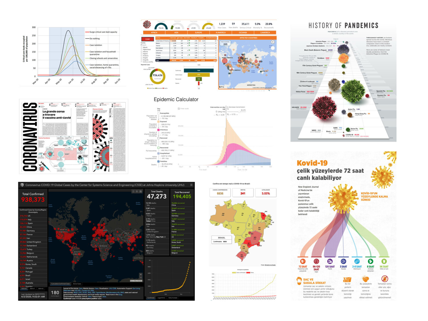
The COVID-19 pandemic is touching every part of our interconnected world. Its impact is being felt in all parts of our lives. An enormous number of visualisations designed to communicate, understand, analyse, and predict a constantly changing situation are appearing on the Internet every day, created by our biomedical community, governments, non-governmental organisations, news media, and the independent data visualisation community at large.
Paul Kahn, in partnership with Hugh Dubberly and the Northeastern University Center for Design, has created COVIC (COVID-19 Online VIsualization Collection), a collection of over 10,000 visual “representations”, intended for teaching and research purposes, all pointing at the same phenomenon: the COVID-19 pandemic and its effects throughout the world. This Namahn talk was the first opportunity to share lessons from the project.
Download presentation (6.57 MB PDF)
Kahn’s talk explains how a hand-full of data visualisation techniques – choropleth and bubble maps, bar charts, line charts and area graphs and several animation and interaction techniques – have been used to characterise data about the disease. He looks at Chinese examples from the early months of the pandemic, as well as a range of dynamic “current medical state” pages being used to communicate the latest figures by the news media and governments. He examines how visualisations based on epidemiology models are used to characterise and predict the spread, and how current state and predictions have begun to blur together. Paul also looks at how visualisation is being used to explain public health rules for hygiene and social distancing and how cell phone data is being used to measure adherence. As the travel restrictions and stay-at-home orders spread, het looks at how visualisations have focused on economic and environmental impact of the pandemic. Finally, he examines how visualisations about the pandemic are both understood and misunderstood.
About the speaker
Paul Kahn specialises in solving large information problems, shaping and designing collections of digital information to improve user experience. He is constantly looking for the difference that makes a difference, the threshold of acceptance, the patterns that connect people to the information they need. Paul returned to the US in 2012 to join Mad*Pow after a decade working in the design community of Paris, France, where he created the first agency in France focused on information architecture, preceded by a decade leading Dynamic Diagrams in Providence RI. He retired from Mad*Pow and now devotes himself entirely to teaching and writing in the US and France.
Contact us at info@namahn.com with any questions.