
Tools and pragmatism in UX design
by Michel Vuijlsteke [20 min read]
There’s a zillion tools for User Experience and User Interface Design. Don’t take my word for it: a simple Google search for “what are the best tools for wireframing” (to take just one aspect of UX) leads you to endless pages of “The 20 best wireframe tools”, “The 14 Best Wireframe Tools”, “18 Best Wireframe Tools Compared (2020)”.
You’ll find names like Figma, Adobe XD, Sketch, or Axure RP but also the likes of TemplateToaster, Moqups, ProtoPie, Cacoo, Marvel, Gliffy and many, many more. They each have carefully listed pros and cons, and they all come with their avid defenders (and/or detractors).
It sometimes seems like we’re always in transition between tools: tempted by the shiny new features on the one hand –look at the wonderful things we’ll be able to do!– but held back by the cost of switching. Forever teetering between the Scylla of too early adoptership and the Charybdis of sunk cost fallacy (insert minute of silence for everyone that built their lives around Sketch and an entire shantytown of plugins only to realise Figma’s perhaps a better way to go forward).
I get it, I really do. When there’s something new I’m always the first one to try it out. But the older I get, the more I feel we risk losing our way in new tools and toolboxes and templates and methods. More and more, when I see the latest Tool Du Jour used by colleagues and co-workers, I get the impression we’re focusing too much on process and tools, and losing sight of the actual result we’re trying to achieve.
Attack ships on fire off the shoulder of Orion
I’m an old, old man. I can scarcely believe it but I’ll be fifty very soon. In the words of Roy Batty: I’ve seen things.
I have always been passionate about information and the tools to classify information. As a small boy I used index cards to make inventory of my father’s huge science fiction, fantasy and horror book collection – it’s probably hard to image my eight-year old self cherishing his hundreds and hundreds of cards in their filing cabinet. And that was Before Computers!
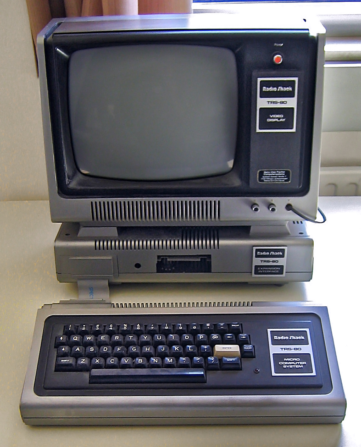
My first computer was a then modern Tandy TRS-80 model I. I’m a veteran of the ZX Spectrum vs. Commodore 64, the Atari ST vs. Amiga and the PC vs. Mac wars (and arguably chose the ’wrong’ side each time). I’ve done newspaper layouts using scissors and glue, then went on to PageMaker, from there to QuarkXPress and then to InDesign – and at each step I remember the same heated discussions about which tool really was the best.
The difference is: there really was a huge difference between, say, QuarkXPress and InDesign and there was an objective reason to choose one tool over the other one. The tools were also incredibly expensive – I remember one memorable occasion when it was cheaper for my company to fly me to New York to buy a suite of software than it was to buy it in Belgium.
The World Wide Web changed all that.
I was spoon-fed on choose-your-own-adventure books and computer adventure games; I was making hypertext documents years before there was HTML. And the moment there was HTML, I started making websites. In 1994 I was making websites for a living and I haven’t stopped since, really. It’s sometimes hard not to feel like a dinosaur: I remember the first <img>, the first <table>, I remember realising the world had changed when I saw FutureSplash Animator in 1996 (which later became Flash), and I remember the same feeling when I saw the CSS Zen Garden in 2003 and Microsoft’s black magic with XMLHttpRequest, that Jesse James Garrett so perfectly framed when he coined Ajax.
HTML was, above all else, the great equaliser. Before the recent-ish explosion of JavaScript frameworks where we suddenly got to single page websites that need to download half the internet to display a Hello world, there was view source.
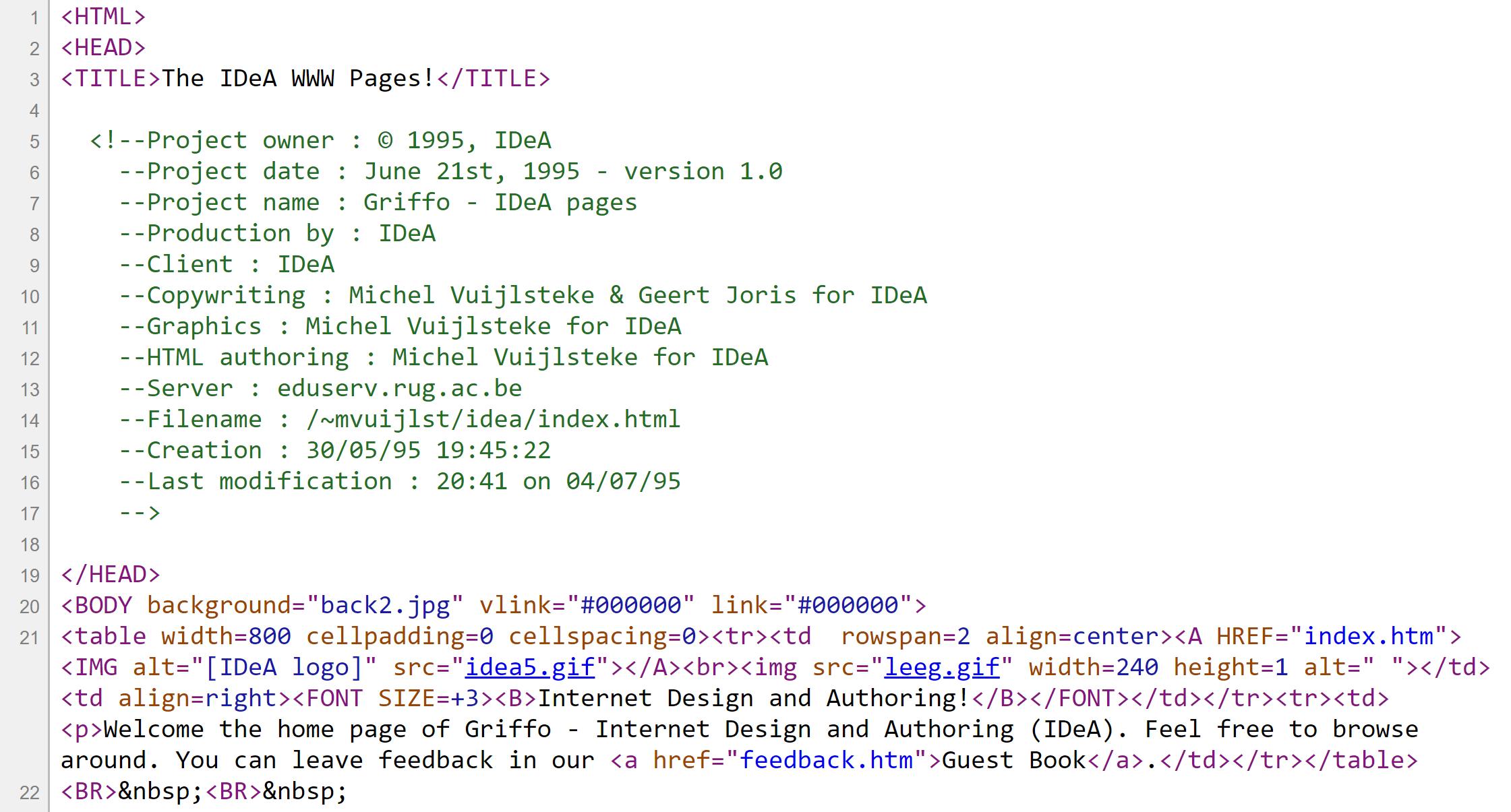
HTML is a very simple way to describe the structure and contents of a web page. Anyone could look at the source code for any web page, learn from it, and make their own. The tool didn’t matter: whether it was Notepad or Sausage Software’s HotDog, it remained no more than text, a couple of tags and some images. The playing field was completely level.
From developer to designer
I have done a lot of software development but I’ve never been a “real” developer.
I was involved in sales, worked with the client to decide what the thing should do, decided together with graphic designers what it should look like, and with developers how exactly it should work.
We didn’t call it like that back then, but we always started from information architecture, then moved to conceptual design and then graphic design: not much has changed, really.
How we made the things and what tools we used: absolutely nobody ever cared. When we made an incredibly extensive website for Pioneer in the early 1990s, many pages were painstakingly hand-created, but other parts were dynamically composed on the server using FoxPro. We later moved to Allaire ColdFusion, and we generated many images that used to be made by hand with Photoshop. Still no one cared.
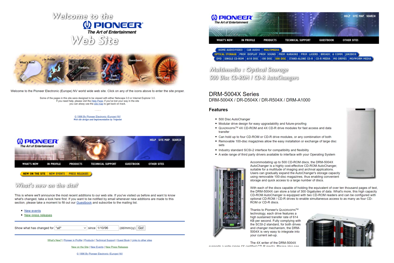
When we needed to communicate our designs to the client, depending on the situation, we showed an actual running web application, or static web pages that looked dynamic, or a dummy web site made in Photoshop, or even pages literally copy-pasted together user print-outs and glue.
It didn’t matter one bit how we got to the design. The only thing that mattered was the result.
That was a huge eye-opener. I used to have these epic discussions (WordPerfect vs. Word! Mac vs. PC!) but working with actual clients for actual money made me pretty pragmatic pretty quickly. And the older I get the more pragmatic I get: I just have no patience any more for discussions between editor A and B, for futzing with details when we should be concentrating on the big picture, or for endlessly looking for new tools for no good reason.
That is not to say that I’ll stick to whatever I’m using now: I’m constantly evaluating new things. But anything new is going to have to be substantially better to make me invest in switching. I also refuse to be defined by the tools I use: we should really be able to do the work we need to do with whatever tool is available, and if there’s no advanced tools available, there’s always pen and paper on the lo-fi end and HTML on the hi-fi end.
Four types of deliverables
I see four target audiences in my design work, and each has its own types of deliverables.
- Myself: need to get my ideas down quickly and efficiently
- Coworkers: need something tangible with just enough details that we can exchange ideas about it
- Client:
- in a first phase, need something abstract enough that we don’t drown in detailed discussions but concrete enough to have a meaningful discussion about
- in a second phase, need something close enough to the final product to get an approval for
- Development team: need something clear and unambiguous, that can be the yardstick for the final product
To avoid any misunderstandings, I’ll define some of those terms:
- Coworker: people I’m closely working together with on a design team. They’re not necessarily Namahn colleagues – as a write this I’m working with a Namahn colleague on a design team consisting of subject matter experts and a product owner from the client, analysts from one subcontractor, visual designers from a second subcontractor and developers from a third subcontractor.
- Client: decision makers at the client’s.
- Development team: on the one hand obviously software developers, but on the other hand often also the visual designers and/or front end team.
You may have noticed that I’m not talking about conceptual design, detailed design and graphical design. Most of the time our work does go through those stages of design, and they are certainly helpful to track where in the process we are, but to me they are almost orthogonal to the four target audiences and their types of deliverables.
I’m typically working either alone, with coworkers, with clients or with developers at many different stages of a project and at many different levels of detail.
Tools, in practice
I do not think there’s one tool that can efficiently deal with all four types of deliverables.
I’ll tell you what works best for me, but the last thing I want to do is to prescribe applications to anyone, because in general and for all deliverables it goes without saying that you should use what you feel you do you best work in. If you prefer working with Figma: not a problem! If Axure is your thing: great! If you feel most productive painting in Excel: you do you, Tatsuo!
I do think it’s incredibly important to always keep costs and benefits in mind. As Voltaire said: Le mieux est l’ennemi du bien. Always weigh the cost of doing something the best way versus having it just good enough.
This sounds easier than it is, because you need to constantly evaluate whether your current ’quick and dirty’ solution isn’t weighing you down in the long run – and this becomes more important the longer-lived your deliverables are.
It’s pretty clear that if you’re doodling a possible concept you don’t need to keep a lot in mind. And it’s also pretty obvious that if just want to quickly show how items in a table might behave when resizing a window you don’t need to make the most perfect interactive prototype – a simple drawing might do the job, or at most some quick HTML. But when your table behaviour starts to get more complex and you need to show how it would work with different data, in different languages on different devices you don’t want to be making all possible variations in Photoshop.
At some point you’ll have to move from away from “good enough”. At some point you’ll run into the limits of whatever tool you’re using and you’ll have to level up. (Sorry: there’s no hard and fast rules. It’s something you learn by doing, or by being told.)
On to the four types of deliverables!
1. Quickly get an idea down – target audience: myself
The main aim is to reduce the distance between brain and page as much as possible.
I like pen and paper (more specifically, either Sharpies on A3 flip chart paper or a fine Uni-Ball Eye rollerball pen in a Leuchtturm1917 A5 dotted notebook). I also like whiteboards. If the whiteboard isn’t ruined beyond erasing and the whiteboard markers too dried out to see, that is.
But I prefer a digital whiteboard (either OneNote or Microsoft Whiteboard). I’ve been using a Microsoft Surface with a stylus for the last seven years, and it’s a game changer. A digital whiteboard is as free as a real whiteboard, except that it stretches out into infinity, you can zoom in or out, there’s an undo, you can move, copy, enlarge or reduce things. You could do the same in a more complex application like Adobe Illustrator, but I prefer there to be as little technology in the way: the less interface the better.
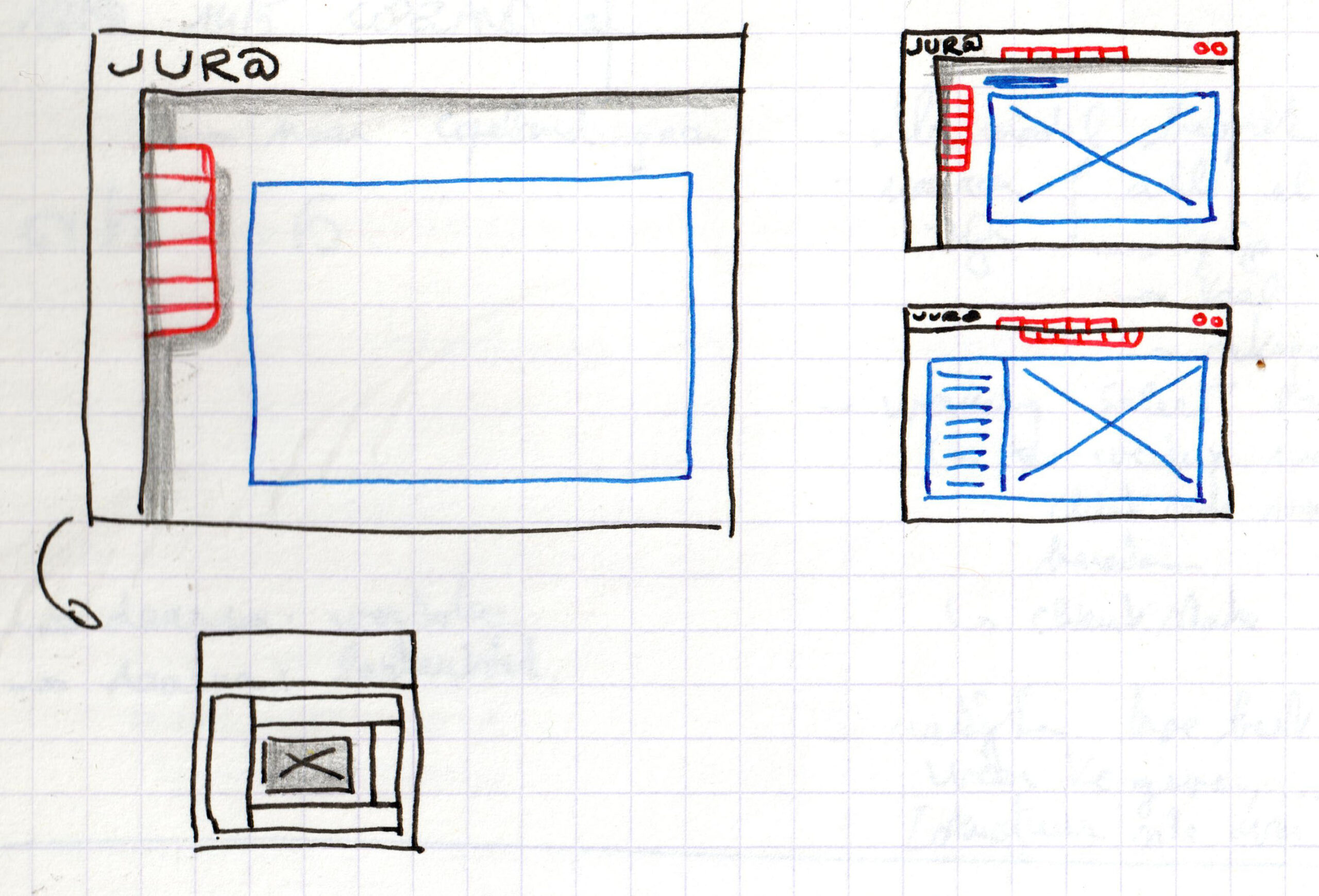
That being said: sometimes exploring ideas works better when there’s more rigidity. When I’m mainly going to be moving boxes around or working with highly repetitive content I tend to use Axure RP. Its repeaters allow me to dump a spreadsheet and immediately get repeated content, and that alone is worth it for me.
And when I’m mainly dealing with text, as in an outline or meeting notes or writing an article, I use org mode in Emacs. Org mode is 17 years old and Emacs was initially released in 1976 so it’s definitely not for the faint at heart, but when you get into it, it’s absolutely a life-changing thing.
2. Collaboration – target audience: coworkers
The main aim here is to make it easy to efficiently collaborate to get to the bottom of a design issue, so it’s probably a good idea to all use the same tool.
For early-stage ideas I prefer a digital whiteboard, for all the reasons mentioned above.
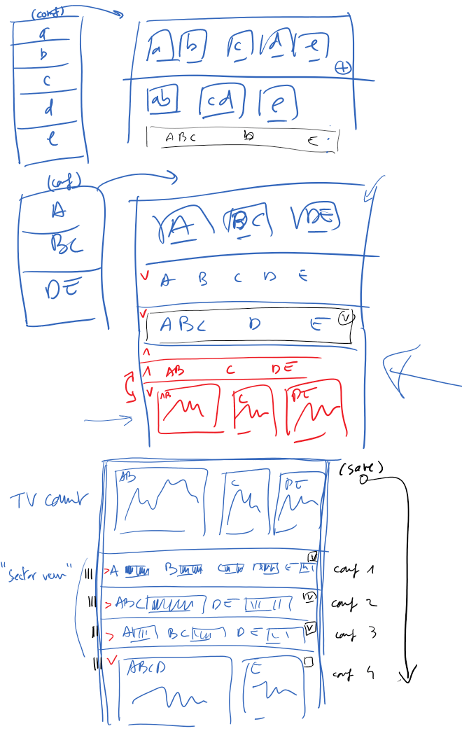

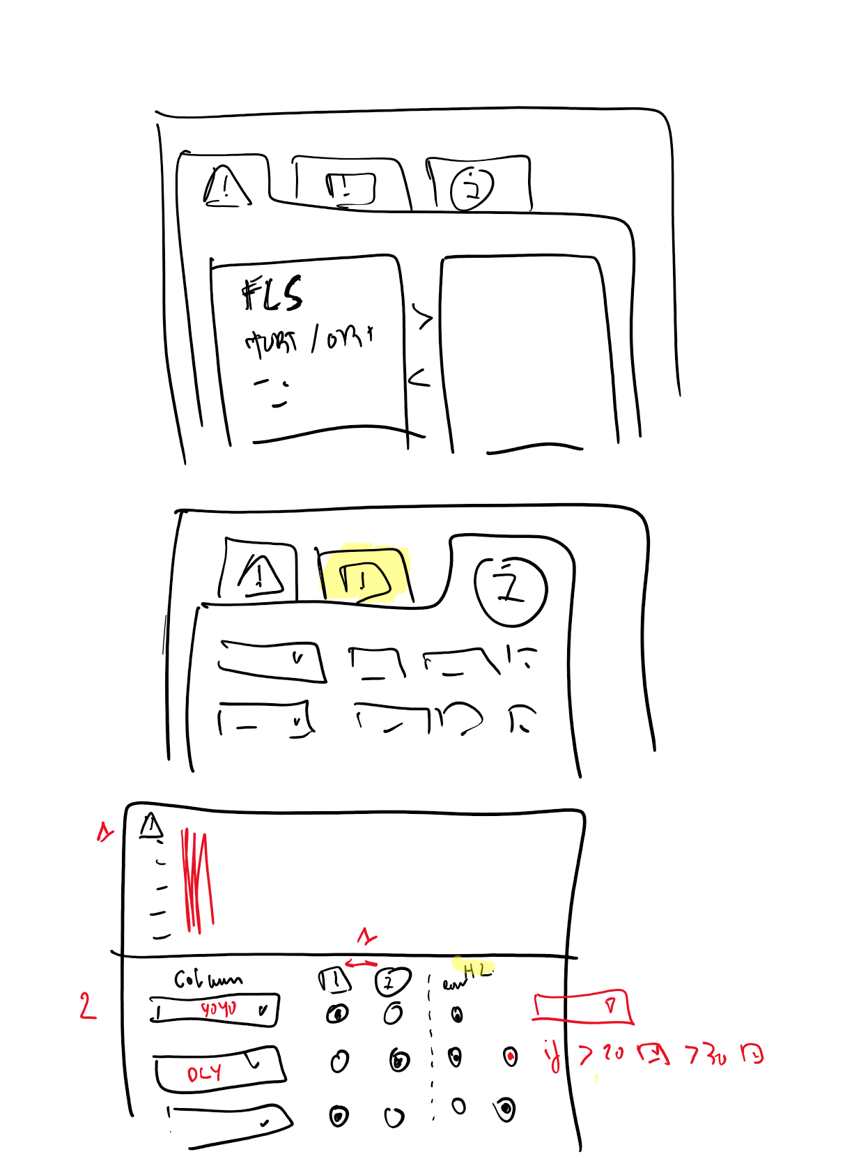
When we’re working on something more technical (e.g. with a lot of real data), when we’re refining an existing design or when more detail is absolutely necessary we use one of two strategies.
Most of the time we get by with Axure. Again, I’m not at all saying this is the best tool there is – it’s just that in the projects I am currently working on we’ve all agreed to use it and it does the job for us: there’s that very useful repeater feature, decent templating, and I appreciate the way I can easily get simple interactivity (with interactions and dynamic panels) without having to jump through hoops or resorting to code.
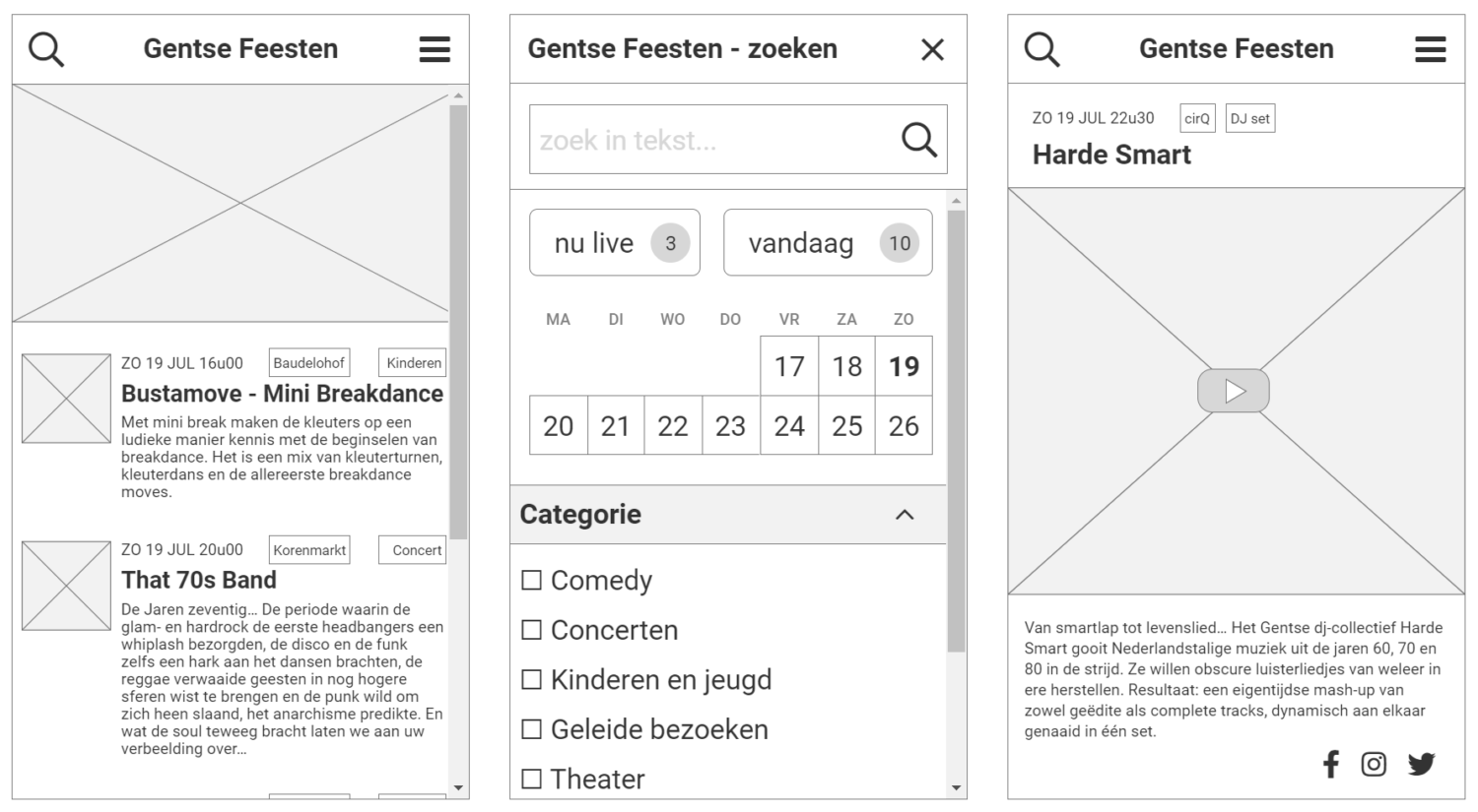
However: when only actual, dynamic, real data and actual real interaction can move us forward we will make a prototype in code. This could be anything from static HTML and CSS to a simple React application using real or mocked data; the important thing is that this is not meant to be production code at all. Its only reason to exist is to conceptualise or visualise a possible solution, so again: unless it makes things easier for you, quick and dirty is enough.
3. Get an OK – target audience: client
This is the first type of deliverable the client (in the sense of “the decision makers at the client”) gets to see. Its main aim is to present the work you’ve done so far as well as possible and to get additional input and/or approval.
If we’re going to work together on different parts of the same project I’d use something that allows us to do that easily. Figma is an obvious choice here, in that it allows people to actually work together at the same time on the same content, but unless we’re really talking about rote work I personally prefer to physically design together, with one person drawing and two people thinking. It may sound like wasting valuable time to have two people doing the same work, but in my experience this kind of “pair designing” cuts time more than in half and vastly improves the quality of the result. It has the added benefit that you can use tools that have much more basic versioning, or that aren’t really made to work for multiple people to work on the same files.
This type of deliverable should not be given to a client without context. Do not send your design to the client without explanation and expect them to give any meaningful feedback. As a general rule I would absolutely recommend to show your work in a presentation. There’s a long article (or even book) to be written on the topic, but I find the most important thing to keep in mind is why you’re making the presentation and who you’re showing it to. In short:
- The basics of your presentation should never be improvised: always know exactly what you’re going to say. Rehearse it until it sounds natural and improvised.
- Be very clear about what you’re asking: input, approval, yes/no, scope decisions, priorities, …
- Know your audience: some clients may react very badly to black and white wireframes, while others understand better what is meant by that level of abstraction. In any case I try to avoid fake placeholder data at all times: either I do not show any data at all and replace any content with grey boxes, or I show data that is as real as possible.
- Time box and scope your presentation. People will inevitably meander away from the topic at hand, but try to keep on track as much as possible.
- Record the presentation or (have someone) make detailed notes. Ideally you’ll be writing the meeting report yourself.
It may sound old-fashioned to talk about presentations and PowerPoint (or Google Slides, or Keynote) when so many tools have great ways to show and share your designs. Yes, you could go over a design proposal in Figma or Adobe XD or Zeplin. You could send the client a URL and go through the file together.
But I want the client to spend as much time and attention as possible on the design and as little as possible on any other distractions. When given the choice between showing my design proposal on an otherwise blank slide or using some other interface, even one as simple as a web browser, I will always choose the first option. I want the distance between the design and the client’s brain to be as short and unencumbered as possible. I also want to direct their attention where I want it to be, and physically not showing anything else except what I want them to think about is the best way to do that.
If issues come up during the presentation (either of the “I hate it!” or the more useful “What if we did this…” variety) it’s up to you how to react. Don’t be afraid to say “I don’t know (yet)” or to say there’s no time to go into suggestions. Try to avoid getting bogged down in discussions that go outside the scope of the meeting – but if the opportunity presents itself, if there’s room for it and if you feel up to it: do take the opportunity for some on-the-spot co-design.
As for tools in that kind of situation: we’re sort of back in the previous deliverable, where efficiency and communication are key. If you’re in a physical meeting a whiteboard or flipchart is ideal; if you feel like using a computer, make sure you’re so comfortable with whatever you’re going to use that you’re not going to choke, even with the added pressure of an (important) audience watching your every move. (I’ve done more than one impromptu design with nothing more than Excel, just saying.)
4. Specification – target audience: development
When you hand over your design to developers, the main aim is to let developers do what they do best and not to make them second-guess you.
There are of course many different types of developers. At best you’ll be working with people that have an affinity for design and that think about solutions together with you. At worst you’ll have to hand over a design to a developer with little experience or with perhaps only back-end Java development experience, who can’t really be bothered to think about actual end users.
At best, developers are your best partners; at worst, they can be your worst nightmare.
If you’re in a longer-term project where development and design happen in parallel, you need to find a modus vivendi with the developers. Perhaps it’s because I’ve been on the development end of things, but I absolutely hate it when I see designers that make developers feel like they’re just there to blindly implement Whatever The Designer Has Designed And Now Deigns To Hand Down From On High.
Developers are not at our service, just as we are not at their service: the both of us are at the service of whatever we’re making. Ideally we trust each other and realise we’re both involved in creative and necessary work, just in different ways.
Where possible, participate in developer rituals (e.g. stand-ups or other periodic meetings) and use the tools they use (e.g. don’t force them to look for information in a long unwieldy design document if all their other input is chunked in Jira/Confluence). Avoid potential blocking issues by involving developers early enough: it’s very common that what seems hard to you isn’t necessarily and what seems easy to you isn’t necessarily either. Be flexible and realistic: almost nothing is ever completely impossible, but realistically the costs may outweigh the benefits. This is where trust comes in: you need to be able to trust the developer who tells you something is very difficult, just as the developer needs to be able to trust you when you say you absolutely need something.
The absolute ideal is that you’re able to create and maintain a design system – a living system that contains everything necessary to create applications, from the general design principles down to the detailed specifications of screens and individual components.
Realistically, you’re often working on a screen by screen or component by component basis, and it’s up to you as a designer to keep the bigger picture in your head.
Whether you’re in a long-term iterative process with development or if your project ends with a single handover to a development team, you need to be as clear and as unambiguous as possible in your deliverables. Depending on the design maturity of the developers that could mean anything from simple annotated drawings to a full-blown formal specification with functional and non-functional requirements and detailed guidelines for typography, colour, interaction, screens, components, …
A library of reusable design assets?
There’s a time and a place for UX design component libraries.
On the one hand: nobody likes to reinvent the wheel, and there’s little worse than having to manually change many dozens of screens because some small details common to all those screens have changed. On the other hand: in early iterations of a design we’re realistically just dealing with boxes and the occasional checkbox, radio button or arrow. Is it really worth it to make a component library for conceptual designs or wireframes?
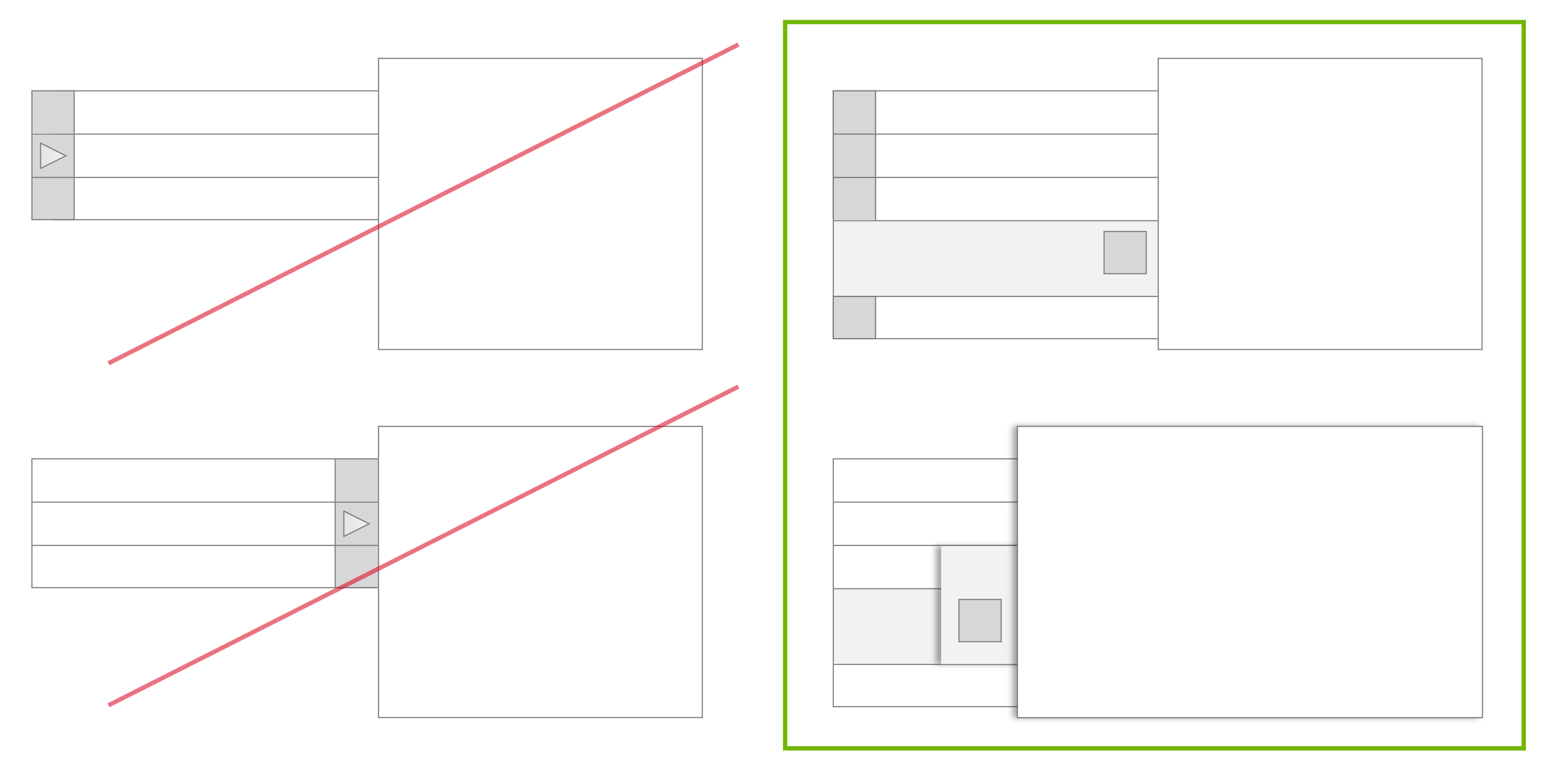
It can be very useful to to leverage templates and components in your tool of choice, e.g. to avoid manually copy-pasting navigation on all your pages or to quickly build up table or grid layouts, but I would argue it’s very, very seldom a good investment to spend time making a wireframing library of headings, forms, navigation, lists etc. for this kind of simple or more informal deliverables.
An actual library with standard fonts, colours and components does make absolute sense when standardisation and consistency are important, i.e. when you’re designing many different screens, when there’s more than one designer involved, and when you’re creating deliverables for client approval or for development.
But then we’re most probably not talking about early conceptual designs or wireframes any more, and whatever library you’re going to make is going to client- or project-specific.
Conclusion
The most important criterium for choosing any tool is how well it fits the purpose: does it help you to quickly set down concepts and ideas? Does it help you to efficiently communicate within your team, with decision makers and with developers?
It’s a poor workman who blames his tools, and in design the medium is not the message. Good design can be communicated well using very basic tools.
Always keep your eyes peeled for new tools. Get to know them, make a small personal test project with anything that looks interesting to get a real feel for them. But don’t jump ship to something new unless there’s an absolutely compelling reason to do so, no matter how tempting it may seem.
Nobody cares how the sausage is made, as long as it’s a good sausage. Spend your time making good sausages, not looking for slightly better sausage machines. And know when you need to make an actual sausage, and when a picture of a good-looking sausage or even an ingredient list is enough.
Posted on July 7, 2020.